Magazine Design, Part 3 - Designing the Contents and Editor's Note
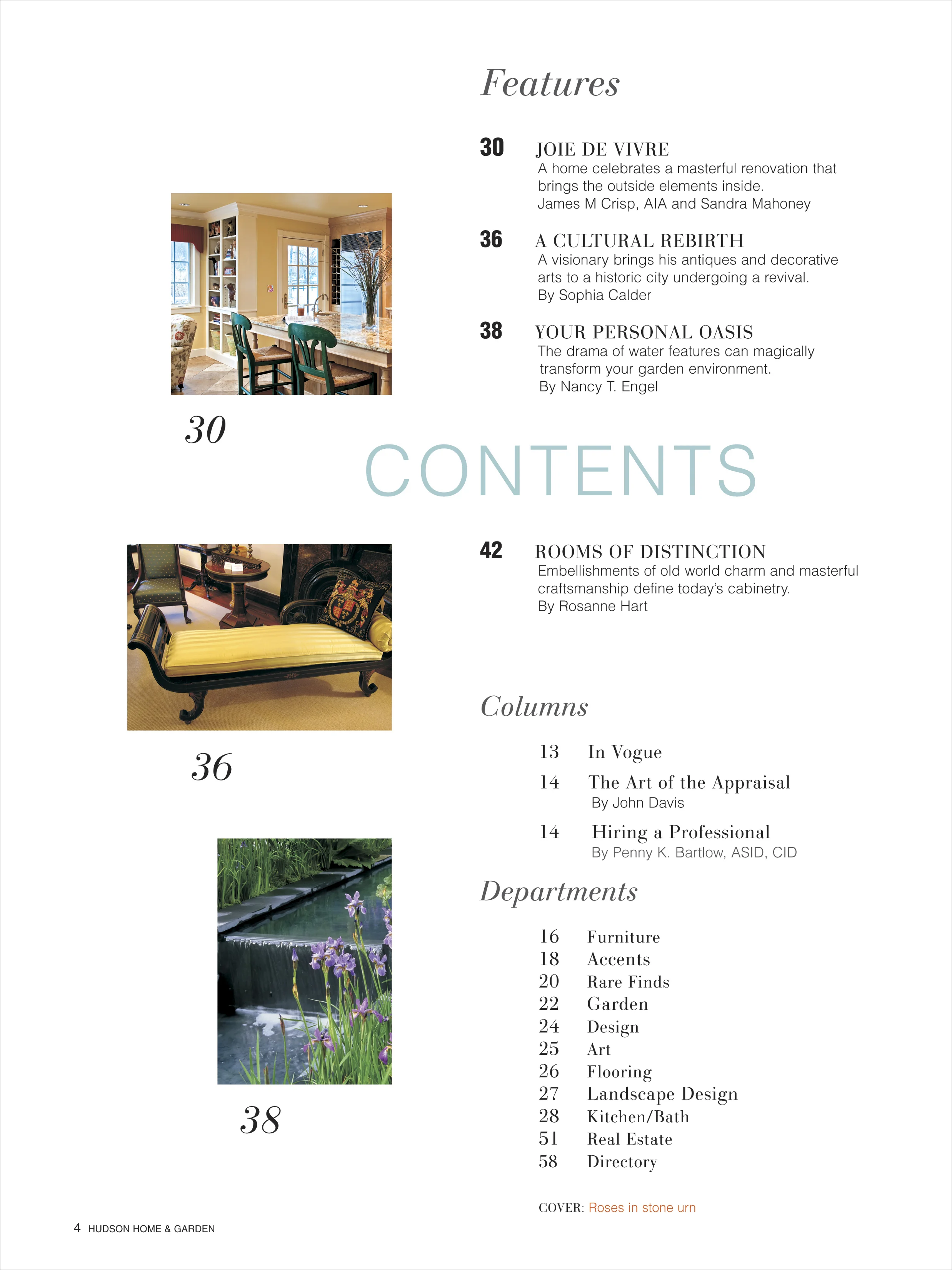
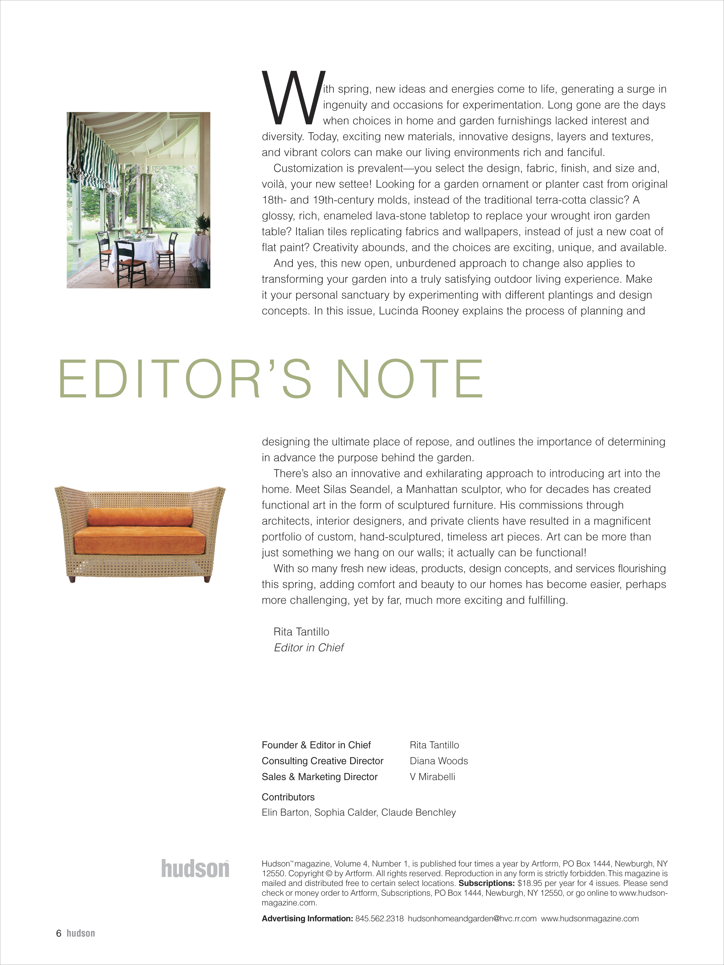
/Hudson Magazine used a very clean design template throughout starting with the Contents Page and Editor’s Note.
Hudson Magazine's Contents page was set up in a two-column format of equal widths. Photos were placed on the left side, the Contents on the right. Mixing two fonts, serif and sans-serif in varying weights and sizes gave balance and emphasis where needed. Color was applied to the word “Contents” to offset the black type and the minimal use of photography.
The Editor’s Note page followed a similar two-column layout with a wider right-hand side column to accommodate the editor’s note. A drop cap added interest to the text.
The design treatment for any project must always remain consistent throughout all aspects. Uniformity guarantees a clean and professional look in addition to staying true to the aesthetic and branding.


