Magazine Design, Part 2 - Logo Design
/Designing the logo brands the magazine even before the first page is turned. The name is as important as its graphic treatment—enticing, trending, eye-catching— enough to be noticed among all the other competing publications on the newsstand.
This post covers the design process for one particular magazine project.
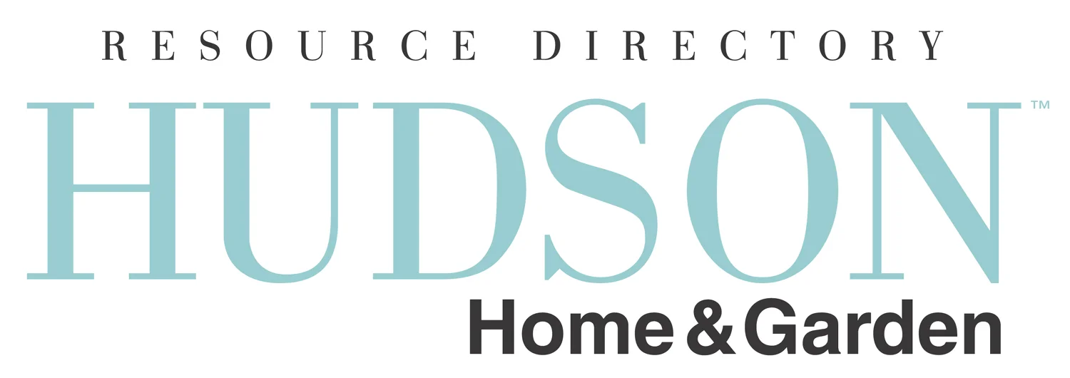
Hudson Home & Garden Resource Directory was the original title for the regional magazine, Hudson Magazine. As the name was somewhat long, the designers chose to split the name into two lines with the emphasis on Hudson while keeping in mind the importance of Home & Garden. Complementing the logo design to the clean, sophisticated look of the magazine was the objective. Three fonts with varying weights created a classic yet modern effect. Font colors changed to enhance the cover image.
The decision to change the name from Hudson Home & Garden Resource Directory to Hudson Magazine was a marketing judgement based on the need to expand the focus of the editorial coverage and advertising to include design and luxury resources along with home and garden.
To achieve a strong graphic look, the designers used a condensed font to maximize the use of space from left to right, as well as top to bottom. A lighter font in the same family was selected for Magazine to offset the strength of Hudson and create tension, resulting in a bold balanced design.


